4 Seasons of Reconciliation Awareness Campaign
Challenge
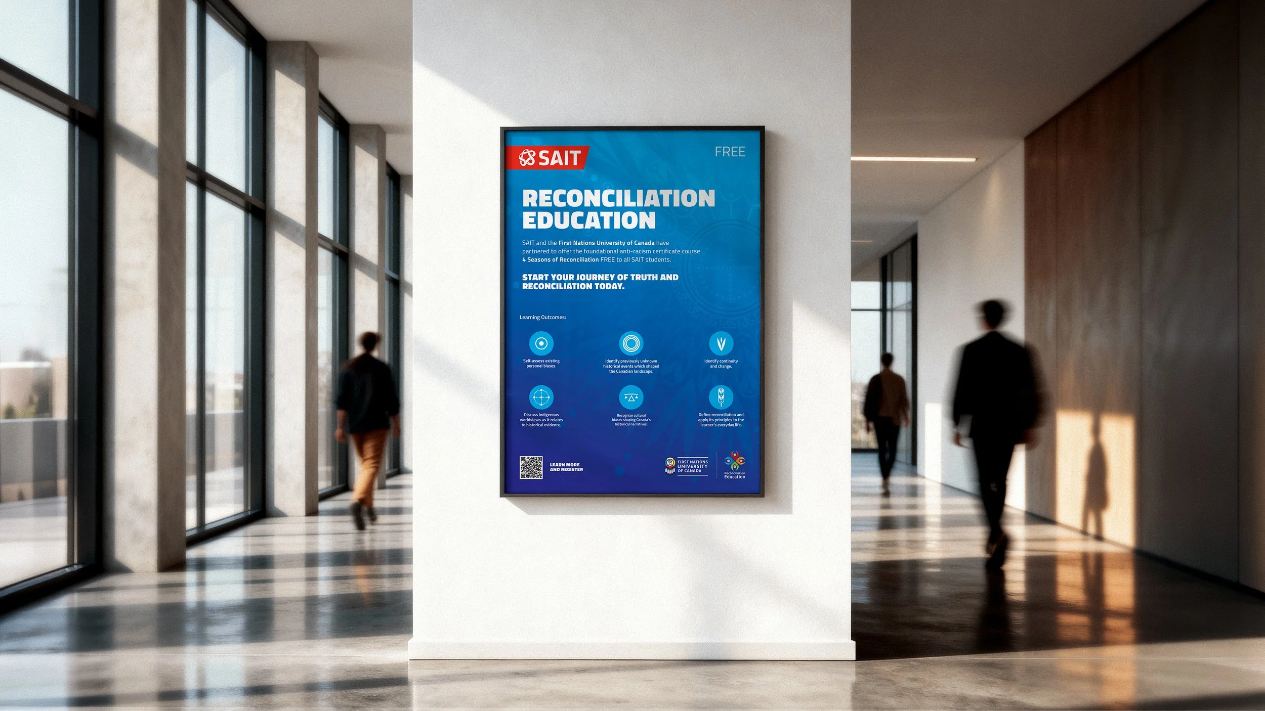
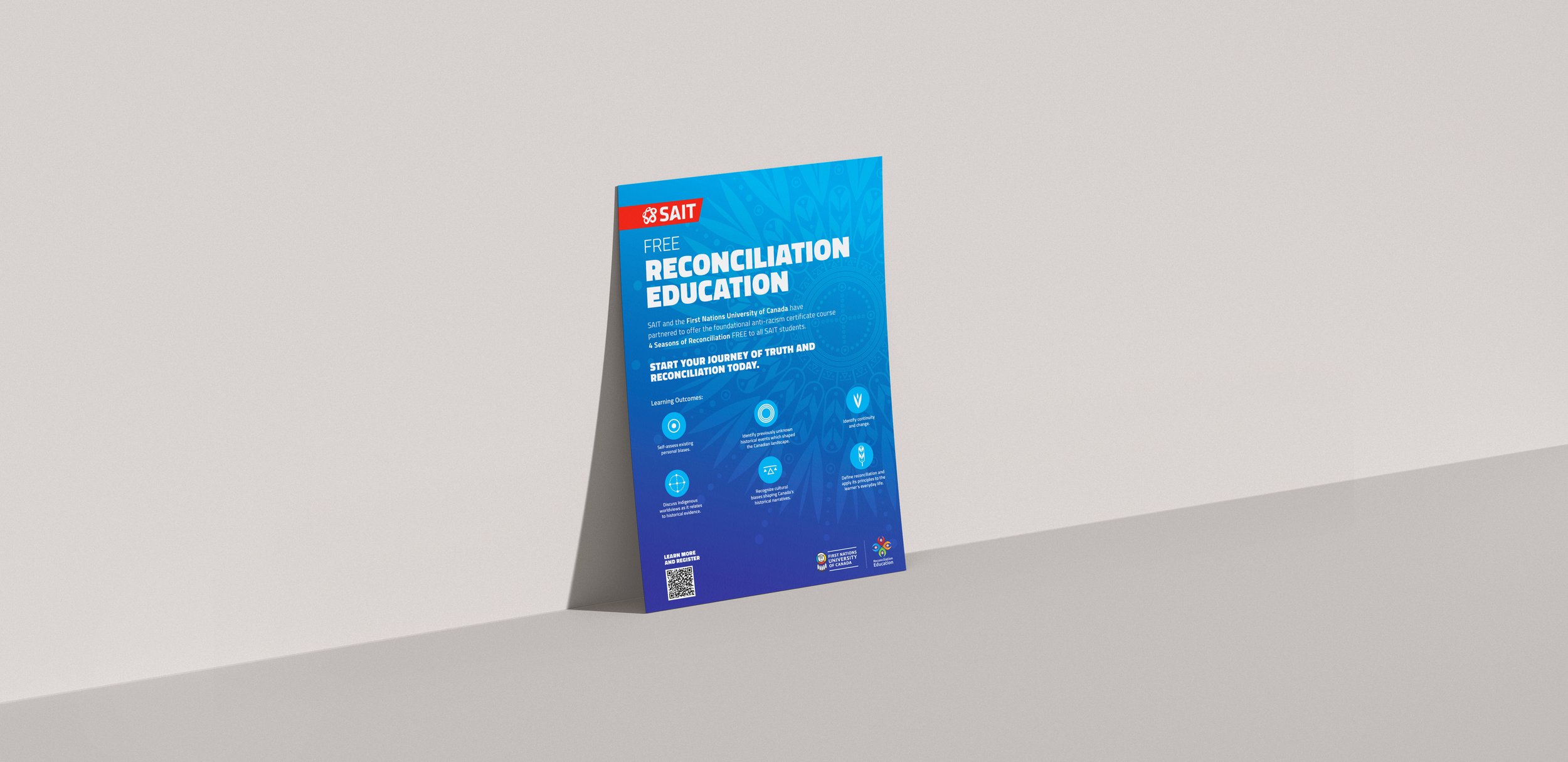
Develop an awareness campaign to promote SAIT's 4 Seasons of Reconciliation course and encourage participation among students and staff. The campaign needed to communicate the importance of reconciliation education while respectfully reflecting Indigenous perspectives and aligning with SAIT's brand standards.
Approach
Working closely with SAIT's Natoysopoyiis Centre for Indigenous Engagement, I developed a visual campaign that balanced educational objectives, cultural sensitivity, and audience engagement. Through consultation, research, and collaboration, I created a visual system rooted in the course's six learning outcomes, using custom iconography and symbolic storytelling to reinforce key themes of reflection, understanding, and reconciliation.
The campaign was designed to work across multiple formats while maintaining a consistent visual identity and clear call to action.
Results
Created a scalable visual campaign across print and digital channels
Developed six custom icons representing the course's core learning outcomes
Increased visual engagement through symbolic storytelling and information design
Supported SAIT's reconciliation education initiatives through accessible, audience-focused communications
Successfully implemented across campus marketing and awareness materials
Project Details
Client: SAIT – Natoysopoyiis Centre for Indigenous Engagement
Role: Lead Designer
Year: 2024
Audience: SAIT students, faculty, and staff
Deliverables:
Poster
Pull-up banner
Postcard
Bookmark
Social media graphics
Internal newsletter graphics
Scope:
Campaign strategy
Visual identity development
Custom icon design
Information design
Print and digital production
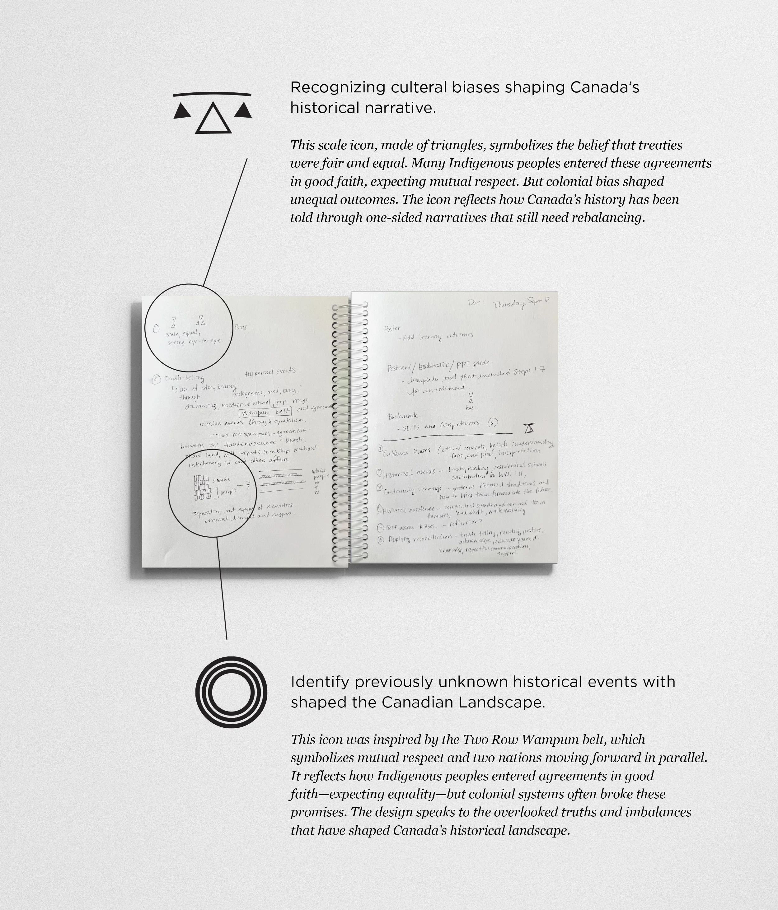
Icons with Purpose
To communicate the course's six learning outcomes, I developed a custom icon system grounded in symbolism rather than decoration. Each icon was designed to represent a specific theme explored throughout the course, translating complex concepts such as historical truth, personal reflection, reconciliation, and continuity into accessible visual forms.
The development of the icons was informed by research, consultation, and insights gained through the Indigenous Canada course. Rather than relying on generic educational imagery, I explored visual metaphors connected to the meaning behind each learning outcome. For example, one icon was inspired by the Two Row Wampum belt, symbolizing parallel paths, mutual respect, and treaty relationships. Another uses an unbalanced scale to represent the need to examine historical narratives and recognize cultural bias.
While each icon functions independently, they were intentionally designed as a connected system. When combined, the six icons form a central star or flower motif that represents connection, learning, growth, and the interconnected nature of Indigenous ways of knowing. This approach allowed the campaign to communicate both individual concepts and the broader message of reconciliation through a cohesive visual language.